Did you know that A+ Content is a way to separate your listings from the countless number of other products on Amazon and help customers remember your product after viewing competitors?
A+ Content engages customers and encourages them to interact with your listing. It is the tool you need to illustrate your brand voice, create a memorable experience, and set your listings apart from the competition. Including A+ Content on your listings can increase conversion rates, build customer loyalty, decrease returns, answer customer questions, and cross-sell similar products.
A+ Content is a free Brand Benefit and is available to Sellers and Vendors that are enrolled in the Amazon Brand Registry. The use of A+ Content has become more prevalent on Amazon, so continue reading to learn how to take your content to the next level. We outline how to get started with A+ Content, answer frequently asked questions, offer helpful hints, provide best practice examples, and help you understand how to avoid rejection of your content.
The Basics
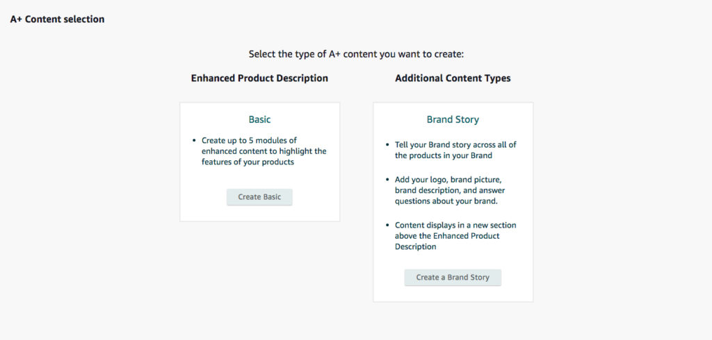
Start creating A+ Content by logging in to Seller or Vendor Central and navigating to the A+ Content Manager tool. Click the button that says “Start creating A+ Content”. You will be able to choose between the Basic or Brand Story layouts.

Contrary to the naming convention, Brand Story is the more limited of the two choices. Merchants can choose modules that include their logo, brand imagery, and a description. The Brand Story content can be published across all products in your Brand, and is a great option to begin cultivating a consistent brand appearance on Amazon.
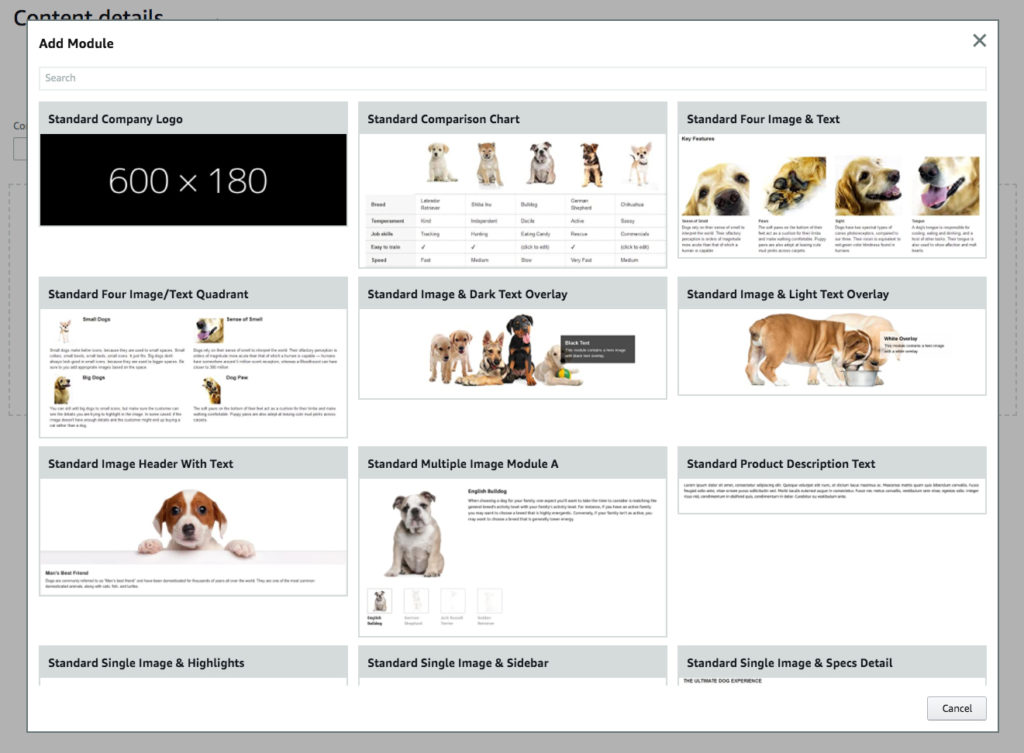
Selecting the Basic option will take you to a blank canvas and allow you to start creating your enriched product information page. Basic A+ Content will allow you to choose up to 5 modules from the 17 available options. You can customize which modules you choose depending on your brand and the specific product.
Your A+ Content can be used to enhance not only Amazon listings, but those on eBay, Walmart, Shopify, and more. There isn’t a simple option to click and share within Amazon, but our ecommerce experts use an external integration that makes it almost as easy. Get in touch and we will be happy to help share your masterpiece, or create it from scratch for you.
Warming Up
Simply having A+ Content on your listing isn’t enough to truly set it apart. Enhance your listing by choosing the right modules, developing an eye-catching design, following Amazon guidelines, and creating experiments to gain insights that allow you to improve your content.
Before you start building, take time to ask yourself a few questions in order to optimize your content and ensure your design communicates the right information.
- What are the competitive advantages and unique selling propositions (USPs) of your product?
- What benefits are your customers going to be most interested in?
- How can you make the product information easy for customers to understand?

Prioritizing this information will make choosing modules easier. There is no singular set of modules that will work best for every product. The choice comes down to what type of module most clearly conveys the information you want to display.
A+ Content FAQ
Each part of the design should complement the piece as a whole and work together to increase customer knowledge and provide a quality shopping experience. Here are some frequent questions we receive about A+ Content.

- Which modules are mobile friendly?
- Most of Amazon’s modules are mobile friendly. If you are particularly concerned about the mobile user experience, avoid both the Standard Image & Text Overlay modules. These always span the full width of a screen and are more difficult to read on a mobile device.
- How should the design balance product information and branding?
- Including branding in the A+ Content shouldn’t be your main focus since an entire layout can now be dedicated to it with the new “Brand Story” option. Include enough branding to stay consistent with other products, but A+ Content should mostly be used to display the benefits of the specific product. Use the space to answer common questions and provide customers with information that motivates them to complete a purchase.
- How should the design balance graphics and text?
- People respond more favorably to graphics and imagery than large blocks of text. Keep all text clear and concise: In rare cases, text may not be needed at all, as some products can be explained entirely through pictures. The goal should be to illustrate your unique selling proposition as clearly and succinctly as possible.
- Can A+ Content be used to promote complementary products?
- One of our favorite modules is the comparison chart because it gives brands the opportunity to highlight and link to similar products. The module provides customers with simple means to find products that they may have not seen in search results.
- One of our favorite modules is the comparison chart because it gives brands the opportunity to highlight and link to similar products. The module provides customers with simple means to find products that they may have not seen in search results.
Helpful Hints
A+ Content is not indexed by Amazon, but the content is indexed by Google and other search engines. That’s why it’s still important to perform thorough keyword research and ensure all images have accurate alt-text.
Think about what the design will look like on both desktop and mobile. This includes looking at graphics when they are blown up and making sure the content is easy to comprehend. We have found that using multi-column layouts with text and images helps the design translate well in most cases for both desktop and mobile devices. The designs result in a good-looking and easy-to-read desktop view, and will transform to a single scrollable column on mobile.
The desire to try and make everything stand out in a small space can be tempting, but remember to use proper visual hierarchy. Think back to when you chose the most important product details and then highlight that message. Do not overwhelm customers with information; your design should guide customers on a journey, rather than show them everything at once.
Examples
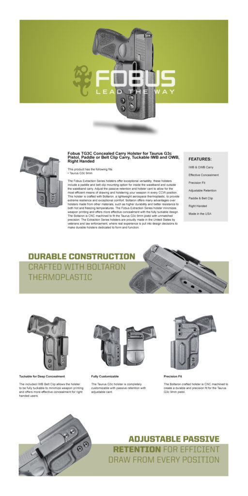
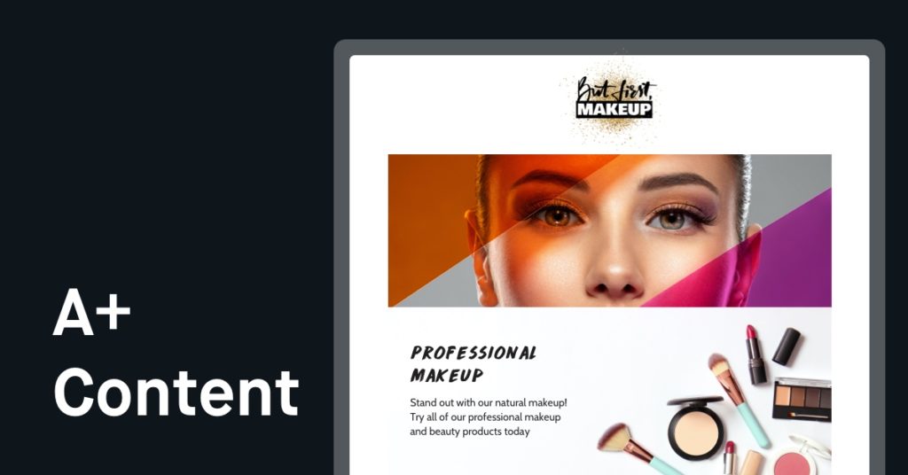
We would be remiss to sing the praises of visual punctuation and not provide evidence to illustrate our point. Here are two completed layouts that demonstrate the best practices of A+ Content design. The first design is image-driven and uses verbiage to complement the graphics. The second example showcases one possible layout for a technical product that requires detailed explanation and further use of text.


The Devil’s in the (A+) Detail
Dedicating significant time and effort to a layout only to have Amazon reject your design can be quite frustrating, so take 5 minutes to double-check the content before you submit. Even if your content sneaks by the initial approval, it could still result in an eventual suspension. Follow the best practices below to help avoid Amazon rejection of your content or listing suppression.

- All content in text boxes, alt-text, and even within images can result in Amazon flagging your listing, so avoid using forbidden keywords and text
- Refrain from referencing restricted products
- Ensure your listing doesn’t use any known Pesticide trigger words
- Don’t use all caps or repeat information, use only plain text as much as possible (no bold/italic)
- Be sure to provide proof and necessary disclosures for any claims; including but not limited to
- Energy-saving claims
- “FDA Approved” or similar medical claims
- Do not include company or customer service contact information
- Redirecting to any site outside of Amazon is forbidden
- Mentioning other resellers is forbidden
- Do not use any registered symbols even if your brand is trademarked
- Do not use quotes or 3rd party reviews
- Use only high quality images
- Do not use blurry photos
- Images should be at least 1,000 pixels wide
- Make sure the specific ASIN is registered to your brand
- If Amazon does not provide a specific reason for your Content rejection, you may simply need to resubmit
Craft a Custom Shopping Experience
Including high-quality A+ Content on your listings enhances the entire customer experience and builds your brand equity. Getting started is easy, although creating high-quality graphics takes a lot of time and effort. Each design should concisely showcase your brand identity and important product details. We recommend hiring a professional Graphic Designer to alleviate some of the more technical workloads.
Remember to make sure your designs are mobile-friendly and don’t make the mistake of forgetting to follow Amazon’s meticulous guidelines.
A+ Content can do more than improve your Amazon listings. Including A+ Content on your listings helps drive external traffic from search engines like Google that index the content.
Make it easy for customers to learn about and trust your products, craft a consistent brand identity, and improve listing performance both on and off Amazon with A+ Content.
By:
Luke Sanders and Abigail Lee
Content Specialists


